
Enhancing retirement plan mana gaps in & online classes
Developing a digital solution to facilitate classes online
Abstract
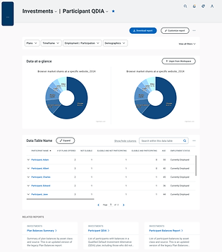
Enhancing the reporting section to manage & Document 401K plans for employees. The platform provides various insights & administration capabilities. The designs & data model for the clients reporting portal for plan sponsors & Plan admins were developed over a decade ago
Our goal was to enhance & simplify the reporting experience

80%
of user feedback for reporting is negative
My role
Majorly worked on Usability Audit, research & analysis , Information architecture & wireframing
Timeline
2021 Aug - 2021 Nov (3 Months)
The team
Team of 3 designers & data scientists
Vertical
Fin tech
B2B
Finding the problem
We started with Usability audit of the current platform to understand where the problem is. Adding on to the audit quantitative data was analysed from adobe analytics & several user goals , user behaviour patterns ( like trend in types of report generated with time) was observed
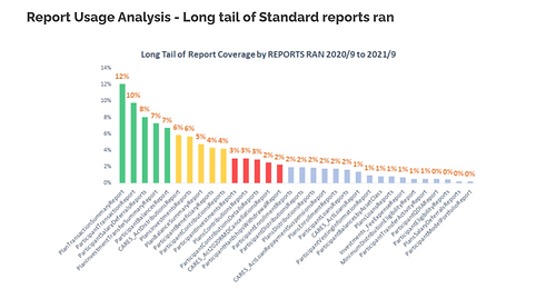

Along with this data we affinity mapped 138 user feedback which was collected over the years to identify problems & areas of scope

Understanding the problem
We mapped out the problems and broke down the problems into smaller chunks
Couldn’t find what they are looking for
55% of the negative feedback came from difficulty in finding a report

"The website is difficult to use"
Users spend approximately 10 mins on a page to figure out what's going on

"The content is not insightful"
Users felt most reports weren’t for them due to inefficient data representation

Building Empathy
Now that problems were clear we built personas to understand the users & decide features, data points for the platform


Ideation
We moved on to Ideations , after Ideating all the features were prioritised for MVP based on feasibility and rest was added to the backlog. Based on the Ideations multiple iterations were made and we made changes based on feedback to decide the final designs


Final design
Before

After
Making information easier to find
Reworking information architecture , data structuring & tagging the data for easier discovery
From our research we understood that the current information architecture had a lot of problems.
-
We reworked the website flow & recategorised the reports.
-
Tagged them based on the information each report had so Users can easily search and find the report they are looking for
-
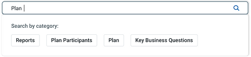
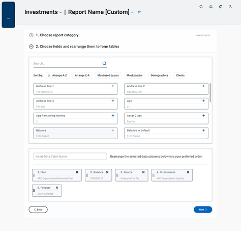
Along with the data structuring we implemented a smart search where user can filter and search the data rather than the report name
Categorising the reports based on data fields

Search by data and not report name

Improvising the usability of the platform
Reworking all UX patterns & bringing hierarchy to the information
Another reason for inefficiency was the platform had usability issues and lacked hierarchy. Users had issues in using the filters or trying to understand how some functionalities worked. Moreover there was no clear visual definition in data & actions.
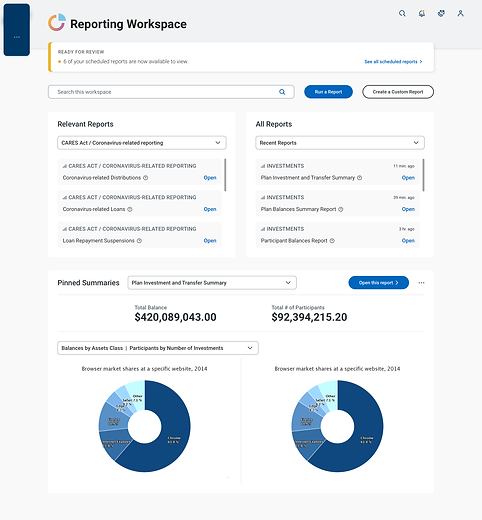
After reworking the site flow we reworked the UX patterns and defined primary data & CTA’s.
Create a custom report flow


Making the website more insightful
Personalising the website with trend analysis & ML
The platform would generate & surface reports based on timely trends and personalise the data with ML algorithms to show tailored filters, information. The platform will show suggest reports based on few trends & the user can customise dashboard with pinned reports. Other analysis features were added to the product backlog
Suggested reports based on usage & trends

Pin reports to dashboard

Conclusion
The feedback was positive from client and the designs were further tested among users and integrated with rest of the Platform. Other proposed features are added into the roadmap.